
This website: a bilingual portfolio built with Claude Code and Figma
How I directed the design, the structure and the reviews of my own portfolio, with Claude Code doing most of the building and Figma holding the design.
Summary
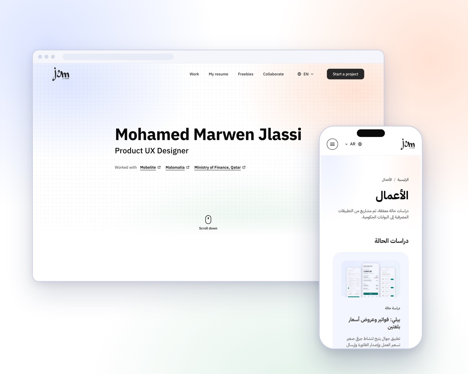
This website is my portfolio, and it is also a case study of its own. It is bilingual (English and Arabic, right to left), has about 40 pages, and runs on ordinary shared hosting with no database, no cookies and no third-party scripts. I directed the work and made the design decisions. Claude Code wrote and tested most of the code, and Figma held the design.
The brief
- Recruiters and clients should explore the site on their own. Anything else, such as a CV or a confidential file, I send by email.
- It had to run on the hosting I already pay for: upload by FTP, PHP only, no database and no paid services.
- Arabic is a first-class language: right-to-left layouts, Arabic type and numbers written 0-9 everywhere.
- Calm and readable: a white background, sentence case, strong contrast and no decoration for its own sake.
- Private by default: no tracking, no hosted downloads and no admin area.
My role
I owned the product decisions: the audience, the structure, the tone, what to show and what to leave out. I wrote the rules the AI had to follow, and I reviewed every result. I did not write most of the code, and I did not need to. My work was deciding what good looks like and checking that we got there.
Figma
Figma held the design. The Home page was designed and approved there first, and its rules for type, spacing, colour and motion became the reference for every other page. When I ported the site from my earlier version, we compared rendered pages with the reference instead of redrawing them. I also rebuilt the DredgCo project-file screens as editable Figma layers, not pictures, and published free files for visitors.
Working with Claude Code
Claude Code did the building: the PHP templates, the CSS, the JavaScript, the email system and a local preview. It also ran reviews. Separate agents acted as a UX researcher, an accessibility reviewer, a security tester and a risk reviewer, and each returned a ranked list. I decided what to fix, what to keep and what to refuse.
Three decisions show how that worked. I removed the downloadable CV, because a CV changes with every job, so recruiters get the keywords and ask me for the version they need. I merged two overlapping collaboration pages into one page with three tabs. And I asked for one name for one action: Start a project.
Information architecture
A first review found two lists that meant almost the same thing, projects and case studies, and five names for one action. I merged them into Work, with the case studies first, cut the main menu to four items and one button, and gave hiring, experts and sponsors one page. Guidance from Nielsen Norman Group and the structure of other designers’ portfolios backed the choices.
Arabic and accessibility
The Arabic pages mirror the English ones: logical layout properties, language and direction set on every page, an Arabic skip link, and numbers written 0-9. The reviews also found weaker error colours, small tap targets and form errors that are not tied to their fields. I fixed the error colour and the skip link. The rest is on my list, and I say so here on purpose.
Email and privacy
The forms send a clean email to me and a short receipt to the sender. The receipt repeats nothing the visitor wrote, so the form cannot be used to send chosen words to a stranger. A signed timestamp, locked counters and limits slow down spam. A privacy notice and terms sit in every footer, with a short notice beside every form.
Where the AI needed me
It wrote numbers in Arabic-script digits where I wanted 0-9, set some headings in capitals, and added a beige tone. I corrected each one, and each correction became a written rule that every later change followed. That habit mattered more than any single prompt.
Result
A bilingual site of about 40 pages with no database, cookies, analytics or third-party scripts. It has a four-item menu, a Work page that leads with the case studies, a brief that opens one question at a time, and emails that look like the rest of the brand. A security reading of the form code found no confirmed vulnerability, and two leads about the abuse limits wait for checks on the live host.
What I learned
- Write the constraints first. An AI follows clear rules better than a mood.
- Ask for reviews from different points of view, then decide yourself.
- Keep the design source of truth in Figma and compare the build with it.
- Saying no made the site better: no CV download, no admin area and no hosted files made it safer and simpler.